British Airways
In 2023, we began migrating our system to Angular 14 due to the end of support for Google AngularJS in late 2021. At the same time, we aimed to improve the accessibility of BA.com to achieve AA compliance, reflecting our commitment to accessibility and meeting the Civil Aviation Authority's (CAA) requirements.
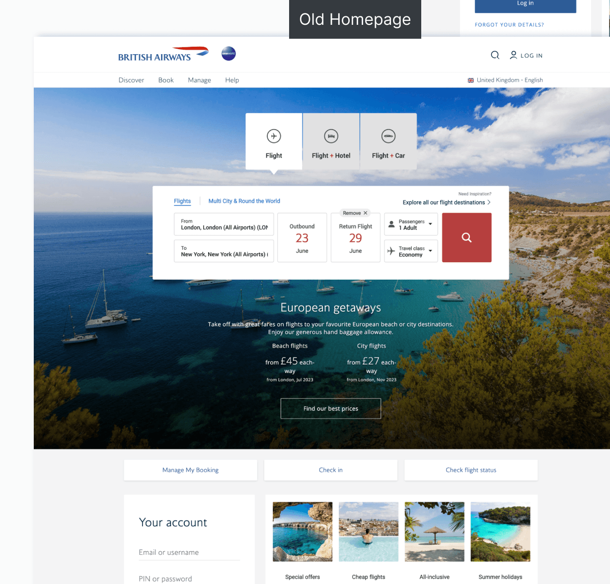
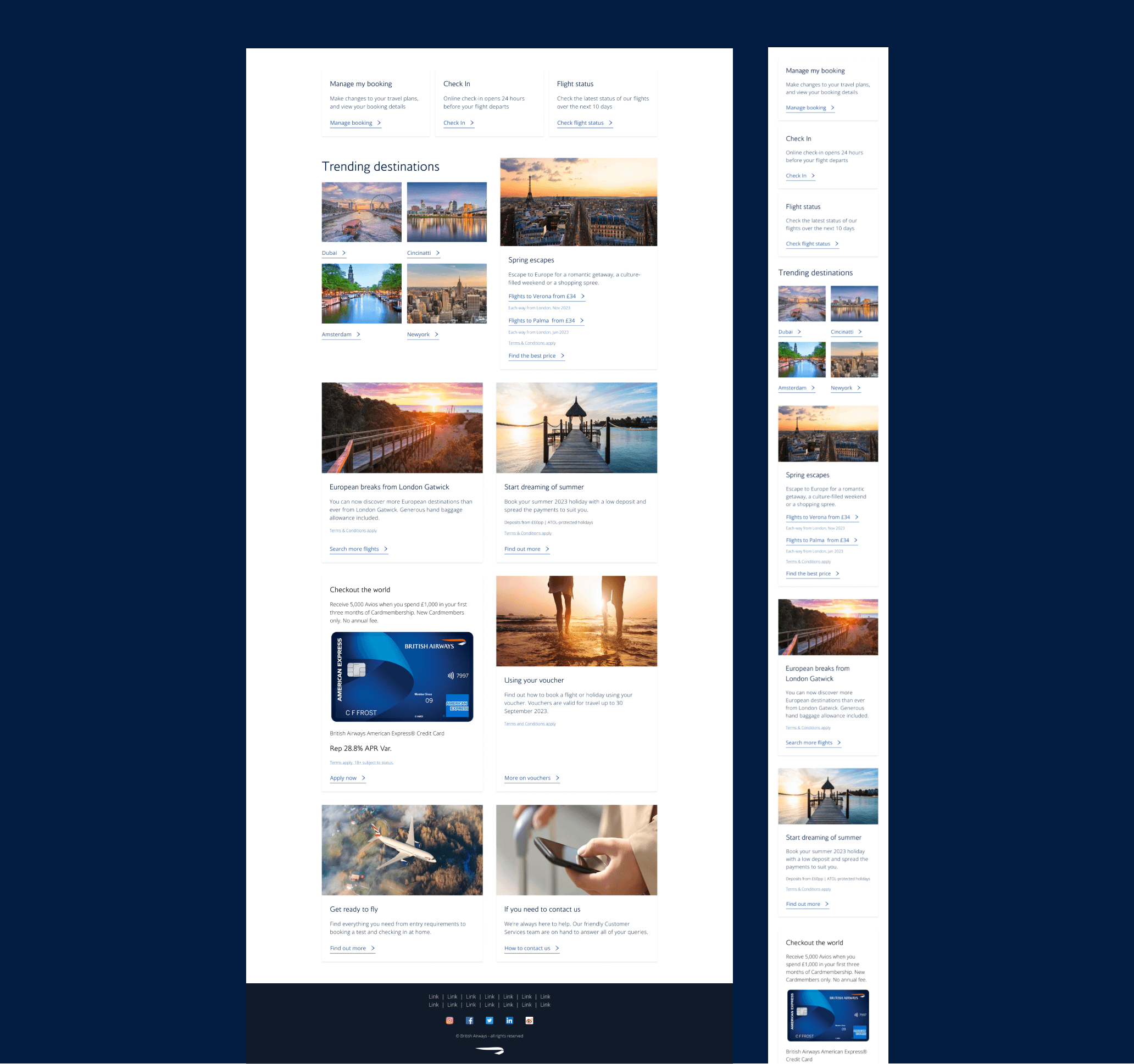
The current homepage is ineffective in engaging users, with 70% of visitors not scrolling below the fold because it's not perceived as a source of travel inspiration. Furthermore, an accessibility review indicates that 50% of users with accessibility needs encounter barriers on the homepage. Many features were implemented without adequate research, tracking, and monitoring, leading to unclear business and customer benefits.
1 x Product designer
1 x Product Owners
2 x Engineers
1 x Content writer
2023
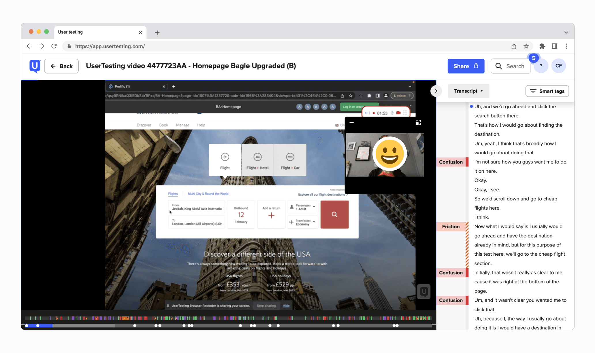
To understand the state of our old homepage, I leveraged insights from data on conversion and engagement metrics alongside usability studies to gather user context. Additionally, I facilitated stakeholder workshops to define the vision for the homepage, while identifying pros and cons of the page from their point of view.
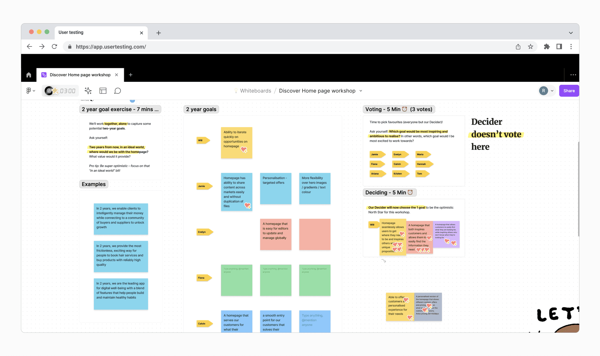
We decided to Migrate features with clear business and customer cases by leveraging data to understand performance while conducting several studies to identify opportunities for improvement within features.
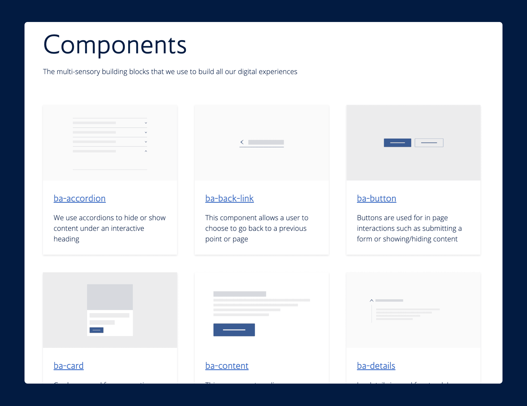
I also advocated for our design system adoption to tackle component-level accessibility constraints, while I focused on accessibility for edge cases and specific usage contexts.
This approach will allow us to move more quickly to create a standard, high-performing homepage, giving us the opportunity to experiment and iterate quickly.
Considering that 70% of users don't scroll below the fold, as they don't perceive it as a source of travel inspiration, this presents an opportunity.
We removed elements with lower traffic, such as the login entry point, recent searches, and upcoming flight information. This frees up space to create a clear navigation structure and content hierarchy below the fold. This revamped section effectively delivers content that aligns with user expectations.
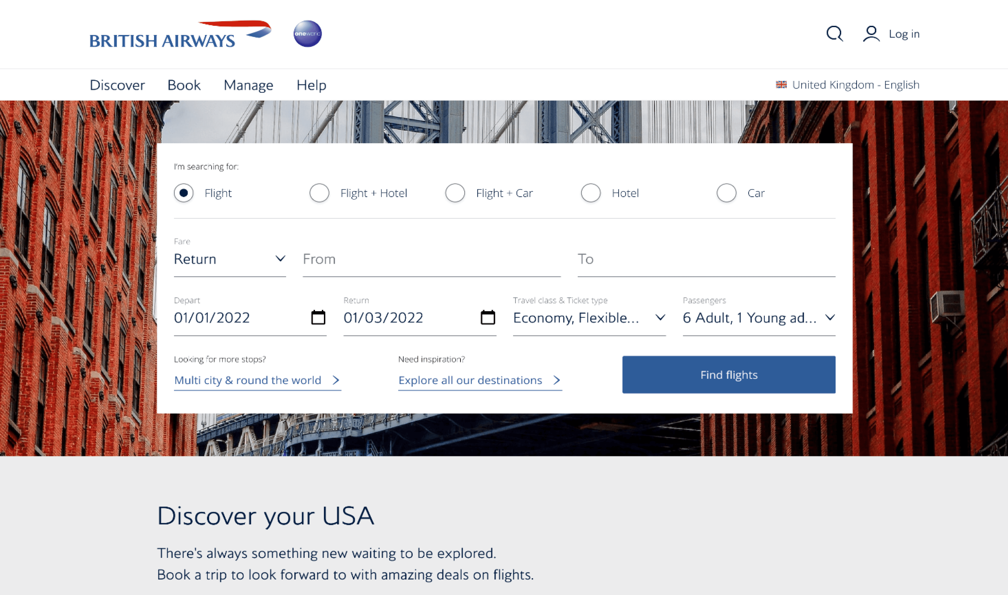
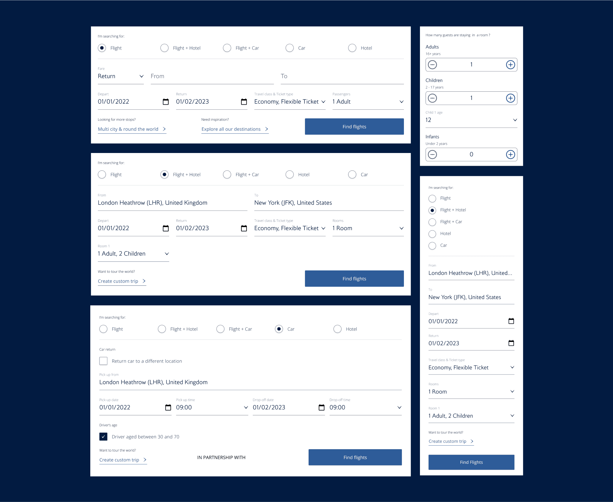
78% of homepage visitors search for flights, making it the most critical section to maintain. The old search component suffered from accessibility and responsiveness issues, hindering successful searches.
The new flight search component enhances the discoverability of our value proposition and ensures a consistent experience across all platforms.
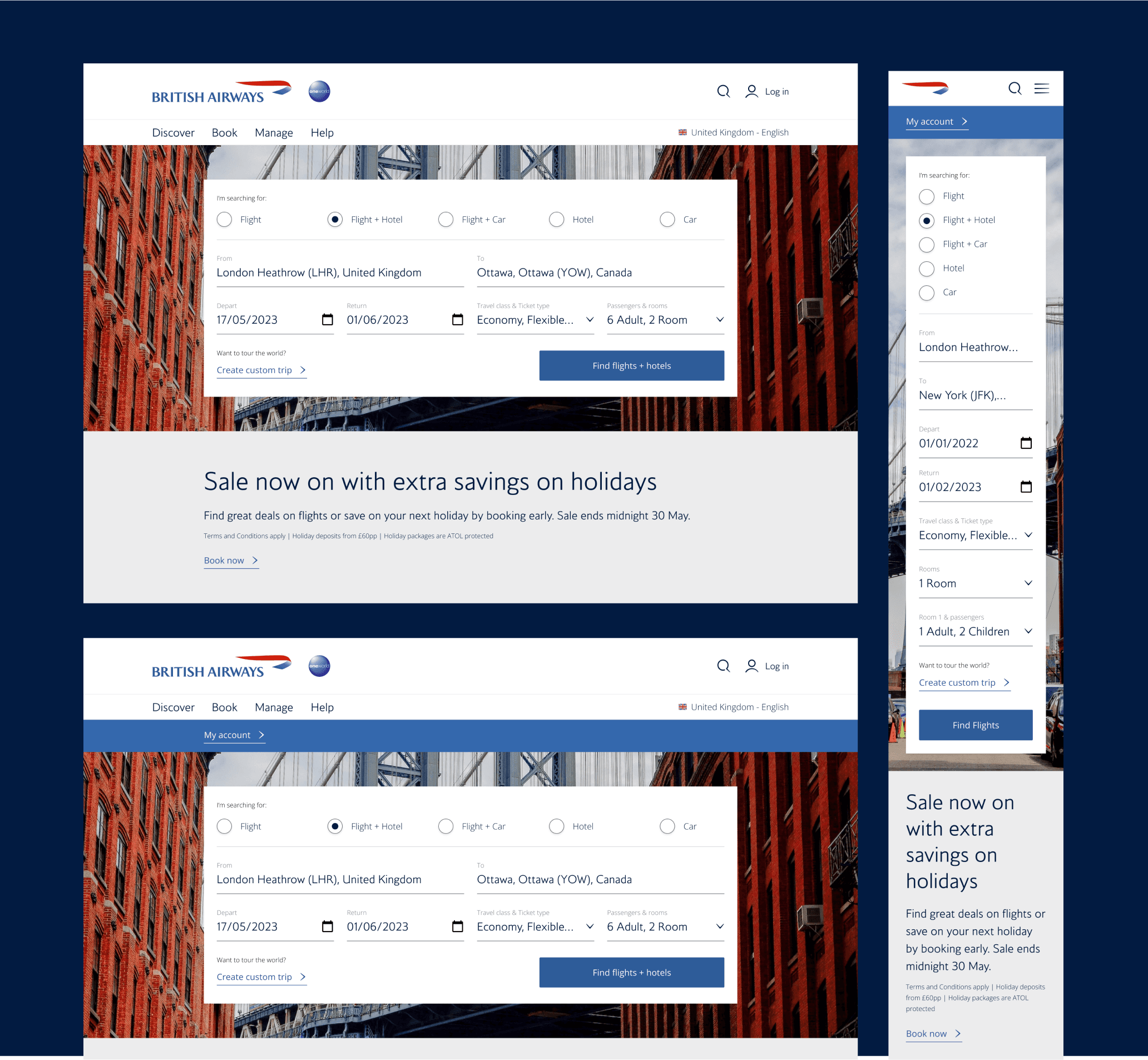
Background images inspire people to travel. However, content placed on these images can sometimes be difficult to read due to insufficient contrast.
The new design addresses this by improving content legibility without compromising the inspirational impact of the images. Additionally, it acknowledges customer loyalty through the use of tier colours.
Outcome
While our newly launched homepage addressed key usability issues and improved business metrics overall, we did encounter some downward trends in the campaign section, booking management, and online check-in.
Impact
✅ 17% increase in flight searches and booking
✅ 21% reduction in failed searches
✅ 55% reduction in accessibility barrier score
✅ 100% on wave tool and google light house